Translate this page into:
The art and science of medical poster presentation
2 Department of Dermatology and STD, JIPMER, Pondicherry, India
Correspondence Address:
Devinder Mohan Thappa
Professor and Head, Department of Dermatology and STD, JIPMER, Pondicherry - 605 006
India
| How to cite this article: Kaimal S, Thappa DM. The art and science of medical poster presentation. Indian J Dermatol Venereol Leprol 2010;76:718-720 |
Posters are an integral part of most scientific conferences. It is important to understand that the "scientific poster" is a distinct form of presentation of research work.
Most scientific organizations or organizing committees draw up specifications for participants to follow for each medium of paper presentation, whether it is an oral presentation or a poster. However, there are still some basic guidelines for preparing a presentation, particularly with regard to posters. This article attempts to highlight some useful guidelines to keep in mind when preparing a poster, as well as some easily avoidable (and commonly committed) errors.
Parts of A Poster
A poster is simply not an entire article or study, enlarged and pasted on a board. It has more visual impact than verbal, and should be engaging to a viewer, simply by virtue of the interest it generates when looked at, without a single word being spoken. A poster should also be self-explanatory, without having to be taken apart and explained to a viewer bit by bit. It essentially consists of:
- Background
- Text
- Graphics
All the above elements of a poster should be evenly (not necessarily equally) balanced to generate a pleasing viewer-friendly visual impact. The goal of an effective poster should be to convey a clear message and support it with a compelling combination of images and short blocks of text. [1] The central theme of a poster should be a clearly stated message, and all supporting text and graphics should point to this message. Anything that does not support this message is redundant and should be left out.
Background
A light background with dark letters is preferable to a dark one, primarily because graphics (images and graphs) stand out better against a light background, and also because a dark background with light lettering is tiring to read. This is especially true in the field of dermatology, which tends to be an image-oriented subject. In addition, sufficient white space is critical for a readable poster. White space should ideally constitute at least 35% of the available space on the poster. [2],[3]
The layout of a poster should have a good visual balance of white space, text and graphics. This balance is achieved when text and graphics are reflected symmetrically across a central horizontal, vertical or diagonal axis, known as the "axis of symmetry". [1] Colour should be used conservatively, but convincingly. A colour scheme is good to follow, as long as it contains only two or three colours, and is consistent throughout the poster. [1]
Text
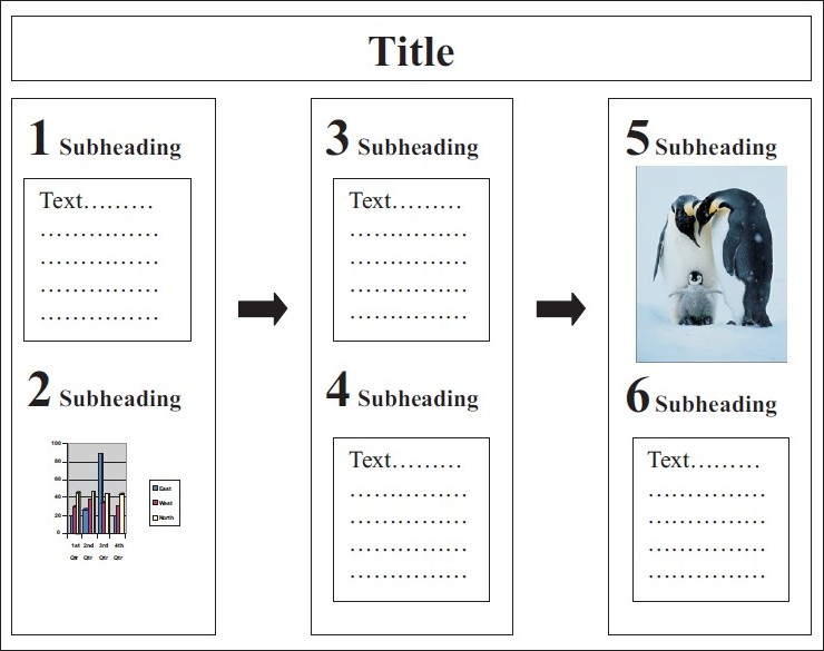
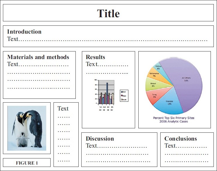
The layout of the text can make or break a poster. Two concepts that are essential for a good layout are - "visual grammar" and "reader gravity". Visual grammar is a graphic hierarchy that helps readers in identifying the most important parts of a poster. Reader gravity pulls the eye from top to bottom and left to right. This is the reason why a column format makes a poster easier to read. Also, the use of organization cues (numbers, letters, arrows) helps to guide readers through a poster. [1] [Figure - 1] shows the layout of a good poster, which uses the column format, with numbers and arrows as organizational cues, while maintaining a diagonal axis of symmetry. [Figure - 2] is an example of a bad poster, in which the sequence of text is not clearly indicated, there is no symmetry, and the large volume of text and graphics make it difficult to read and understand.
 |
| Figure 1: Example of a good poster layout |
 |
| Figure 2: Example of a bad poster layout |
What sections to include in a poster: [2],[3],[4],[5]
- Title - should be brief, simple, catchy, and emphasize the key message of the study. The title has been described as being analogous to a newspaper headline - short, sharp and compelling.
- Introduction/ Background/ Objectives - should generate interest in the viewer (in as few words as possible) about the need for the study, and the context in which it was conducted.
- Methods - should include the study design, materials/ subjects, how the study was done, and statistics used for analysis (if possible, these can be organized into a flowchart format)
- Results - should be the section with the largest emphasis in the poster, and is usually also the longest. A graphical summary precisely meets the needs of a poster - graphs and tables can be used cleverly to cut down the volume of text, and depict results effectively, but should not overcrowd the poster.
- Conclusions - the first section that many viewers will look at, after the title. Conclusions should briefly state the hypothesis again, and whether the study supports it or not. Wording should be unambiguous, crisp, and deliver a clear message about any interesting findings and the relevance of the study with respect to existing literature.
- References - should follow standard reference format, and be restricted to a maximum of 10 references.
- Acknowledgements (if any)
Note: An abstract is not usually included on a poster unless the conference guidelines specifically ask for it.
The title should be in the largest font, with all subsequent sub-titles and text in progressively smaller font. Font size is proportional to importance:
- Title and sub-headings: largest (font size 36); readable from 6 feet away (the title should be at least 5 cm tall)
- Text: medium (font size 24); readable from 4 feet away
- Details: smallest (font size 14-18); readable from 3 feet away
An easy method to make sure the font size is big enough is to print the poster on a standard sheet of paper - one should be able to read all of it - including text in figures - comfortably. [1],[6] The word count should be kept as low as possible - 800 words or less. [2]
Using a serif font (e.g., Times New Roman) for text and a sans-serif font (e.g., Arial) for titles and headings makes a poster easier to read. [1]
For the bulk of the text, phrases (in active voice) are preferable to full sentences. Details should be kept to a minimum, with individual blocks of text containing a maximum of 50-75 words. [1],[5] Acronyms, technical jargon and abbreviations should be avoided as far as possible. Text should ideally be left-justified; avoid centering and right-justifying text. [1]
Graphics
Graphics (graphs, photographs and illustrations) can make or break a poster. The key is to keep graphics simple and clean. This is particularly true with respect to graphs and pie charts, which should be kept as simple as possible in order to be effective. The idea is not to confuse the viewer, but to highlight important statistical findings by using good graphics. Graphs should ideally be two-dimensional, rather than three-dimensional. Elements within the graph should be directly labeled on the graph, rather than using a key, which can be frustrating for a viewer to find and interpret. Labels for the X and Y axis should be formatted in "sentence case", not in "title case" or "all caps". Also, the Y axis labels should ideally be oriented horizontally, instead of along the axis. Grid lines, boxes, data markers, and coloured backgrounds are not required in graphs, and can be dispensed with. [1],[2]
Photographs can be used, as long as they help in emphasizing the message of the poster. A thin black or grey border around a good quality high-resolution photograph enhances its visual impact. [2] Hand-drawn artwork can be used intelligently, but sparingly, on graphs, figures or elsewhere on the poster to make it more creative and to hold the attention of viewers. [1]
Finally, a poster can be very easily prepared in one′s own office or home with even an elementary knowledge of programs such as Microsoft Powerpoint, Microsoft Excel, Deltagraph and Adobe Photoshop. Powerpoint also has poster templates in fixed sizes and formats, available online (search google for "powerpoint poster template"). A cheaper alternative for those who do not have access to Microsoft Office is OpenOffice (free download available online), which contains "Impress" - the OpenOffice version of Powerpoint. For the technologically challenged, there are several computer professionals/ graphics designers/ friends to choose from, for a fee, of course.
Recommendations for size of posters vary from conference to conference, although most Indian scientific associations specify a poster size of 3′ × 4′. Posters may be oriented vertically (portrait layout) or horizontally (landscape layout) on the board provided at the venue. There are several materials (ranging from regular A4 size paper to photographic paper) to choose from while getting a poster professionally printed; the choice is individual, and to some extent, determined by cost.
It is advisable to plan and prepare the poster well ahead of time, so that one can read and review the poster for further editing, and typographical and grammatical errors. An easy way to pick up mistakes is to read the lines backwards - the reverse word order highlights errors that are easy to miss when read normally. Asking a friend or colleague to review the final poster is a good idea before printing the final version. Once printed, a poster can be carried safely to the conference venue in a specially designed hard poster tube, with a carrying handle (usually available at the place where the poster is printed). The same tube may be used for storing the poster after the event. On the day of the presentation, one must arrive early, and bring plenty of supplies for putting up the poster. Always be available near the poster during the designated time, so that questions from interested viewers and judges can be answered. [5]
| 1. |
Hess G, Tosney K, Liegel L. Creating effective poster presentations. Available from: http://www.ncsu.edu/project/posters/NewSite/. [Cited 18 March, 2010].
[Google Scholar]
|
| 2. |
Purrington C. Advice on designing scientific posters. Available from: http://www.swarthmore.edu/NatSci/cpurrin1/posteradvice.htm. [Cited 18 March, 2010].
[Google Scholar]
|
| 3. |
Erren TC, Bourne PE. Ten simple rules for a good poster presentation. PLoS Comput Biol 2007;3:102.
[Google Scholar]
|
| 4. |
White A, White L. Preparing a poster. Acupunct Med 2003;21:23-7.
[Google Scholar]
|
| 5. |
Hamilton CW. A stepwise approach to successful poster presentations. Chest 2008;134:457-9.
[Google Scholar]
|
| 6. |
Tosney K. How to create a poster that graphically communicates your message. Available from: http://www.bio.miami.edu/ktosney/file/good8.html. [Cited 18 March, 2010].
[Google Scholar]
|
Fulltext Views
8,430
PDF downloads
4,256


